I still need to improve on my landscapes. But this tutorial made a big difference in my confidence level.
First published December 2, 2023: I don’t know why I have so much trouble with landscape painting. If I get the colors right, then the composition is wonky. If I finally have the layout I want, then the colors are not what I was trying to achieve. That is why I signed up for Heather Neilson’s Four Approaches to Strong Abstract Landscapes. Heather is a Golden Paint instructor who really knows how to play on the paper until she gets what she wants.
Heather is the third Golden Paint instructor I have taken a course from. Each expert has brought something very valuable to the table when it comes to painting in acrylics. While I do not use Golden Paints exclusively, most of my paintings contain at least a couple of Golden Paints. (No, I do not get paid for reporting this 🙂 ). I like fluid paints best, because they are (mostly) semi-transparent, which helps give layers and depth to my work.
The idea of a landscape is not just about orientation. It is about depicting scenery using a horizontal flow of colorful information that somehow shows movement, depth, and a horizon through the use of shadows, tints, texture and line. (There is a much simpler definition, but I added the caveats that I think a painter needs to achieve when they paint a landscape.)
Heather brings a great knowledge of color into the picture. She uses colors I normally avoid (orange, for instance). And she makes them work for her. She shows four different approaches to creating small landscapes in four videos, plus an intro. I recommend this tutorial for anyone who is trying to enhance their landscape capabilities. While I am not thrilled with the second of the four (using a palette knife), I want to show my results whether I liked the result or not. I plan to create a large version of my first one (see below). I really like how it turned out.
Here are my results from Heather’s tutorials:
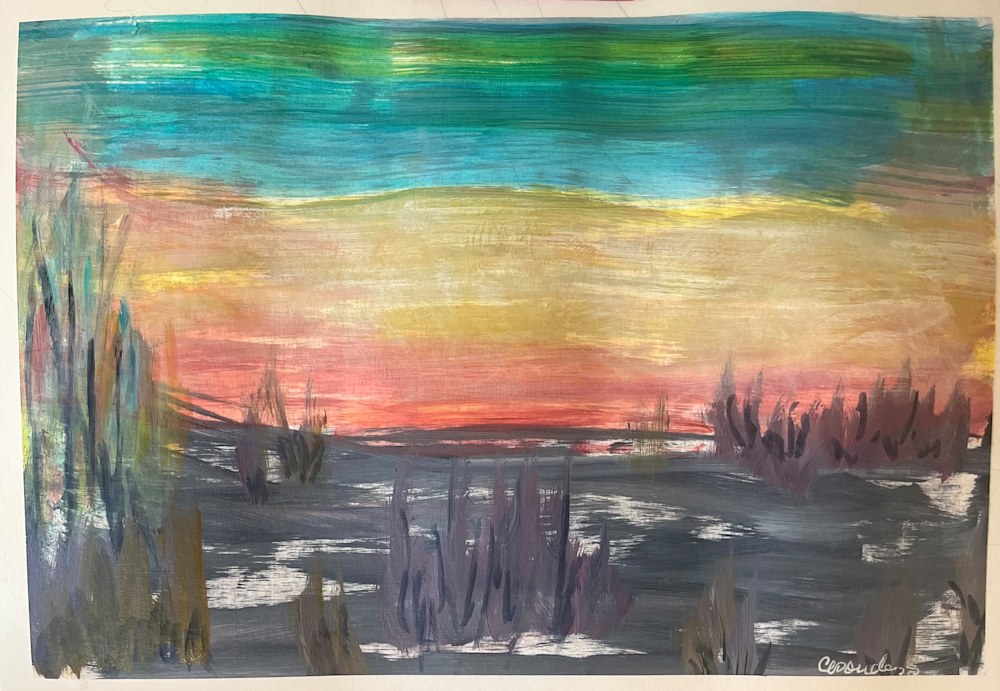 This is the one I really like and will most likely try to redo on large canvas.
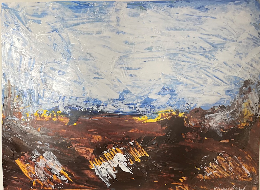 This was done with a palette knife. I am not thrilled with the yellow-blue-brown combination.
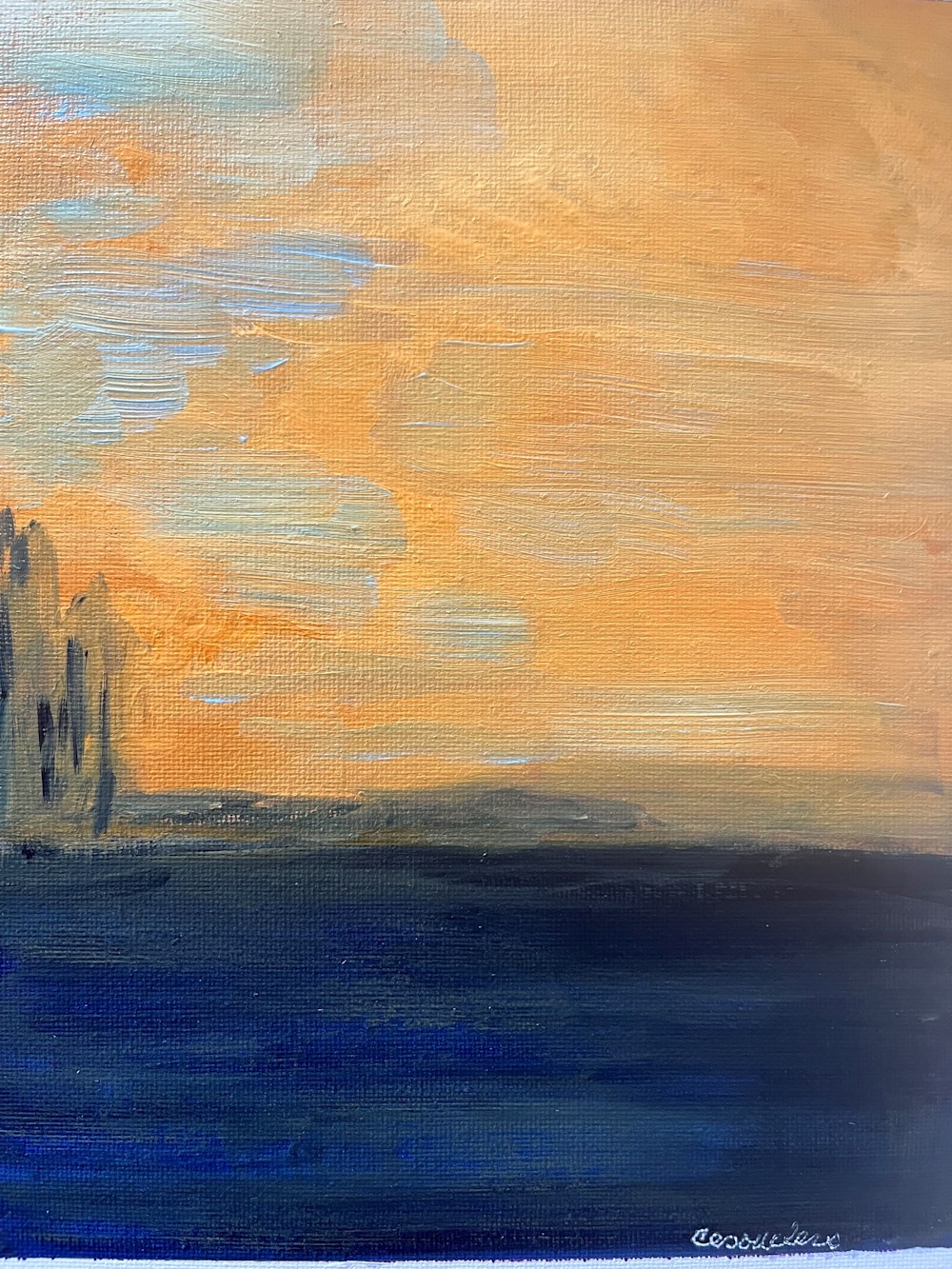 This was a basic exercise to show the effectiveness of a portrait-oriented landscape. I never thought I would like the orange, but I think it worked here.
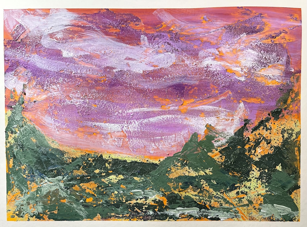 This was a tough one. Heather used Modeling Paste, which I did not have. So I tried Liquitex’s Liquithick, which looked similar to what she used. It went on quite rough, almost grainy, which made painting over it kind of challenging. I like the forefront, but the sky is a hot mess. Also — my paper got pretty wet and bumpy which makes painting a challenge. Live and learn.
Please note that I never try to create the same thing the instructor does. I want to learn the technique, but I will practice it in my own (left-handed) way. I mixed most of my colors, so mine did not match exactly and probably had an impact on how the colors reacted with each other. That is fine with me!
When you take any of these classes that I review, I hope you go in with an open mind, and remember to honor your own vision and style and that can help you to develop your niche in the art market.
Happy painting this week!
P.S. Heather’s tutorial is part of Art Bundles for Good, a package of more than 100 tutorials sold to benefit Courageous Kitchen, which is a non-profit organization in Thailand supporting at-risk youth.