
For one of my art class reviews this week, I painted a landscape in pastels. I was not, to say the least, thrilled with its result. That made me realize that I needed to see what the same reference photo would look like in acrylic… and what about watercolors? Here is what I found…
First published November 8, 2023: I finished my first landscape in pastels this week, and decided to try again with a favorite photo of mine. The photo is of a garden wall that I took on one of my many walks in Anaheim Hills, California when I used to live there. Here is the reference photo:
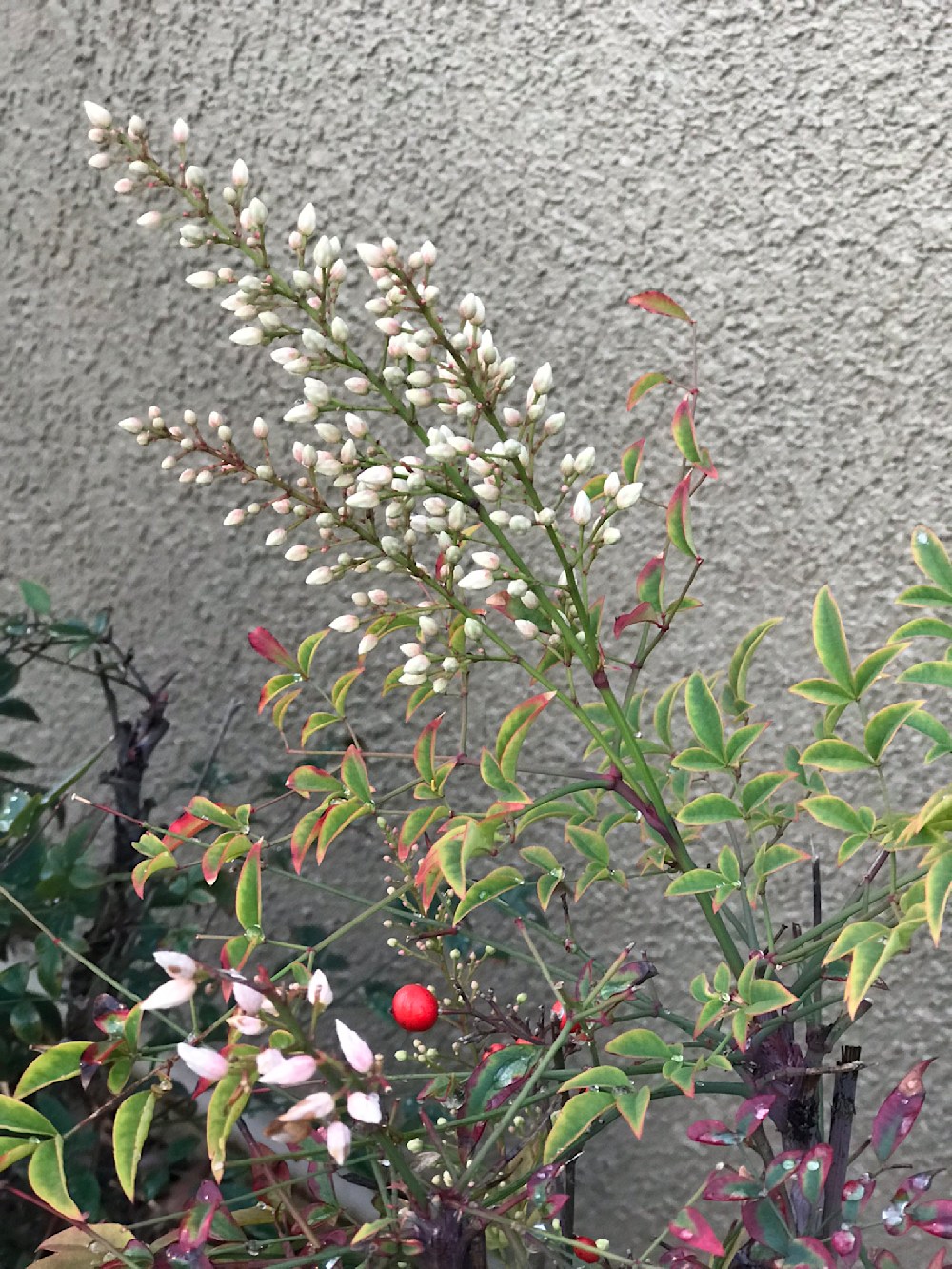 I have no idea what the flowers are, but I liked the white buds against the adobe wall.
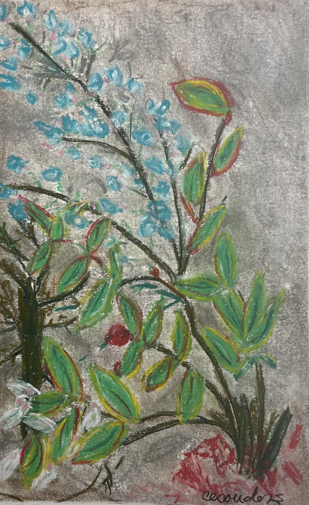
The first painting I did used soft pastels.. mostly grey (for wall), a couple of different greens, a couple of yellows and one hot pink. This was only my second time painting with pastels, and I was not thrilled with the outcome.
The main challenges were:
- Capturing the texture of the wall
- Getting my green to be bright enough
- Forming thin enough lines for branches and leaf outlines
- Getting a nice white on the beautiful buds in upper left of reference photo.
The main points of interest I captured using the pastels were:
- The branches bend nicely, giving a bit of movement to the overall composition
- The green finally turned out very close in intensity to the reference photo
- The red really popped
In summary, pastels don’t feel like my thing. They are very dusty to work with, and while they can layer nicely (dark to light), the overall appearance of the painting reminds me of crayon drawings. Here is the finished piece:
 DISCLAIMER: I do not have anywhere near the experience with pastels that I do with acrylics and watercolors. But I think the challenges remain the same.
Onto Acrylics:
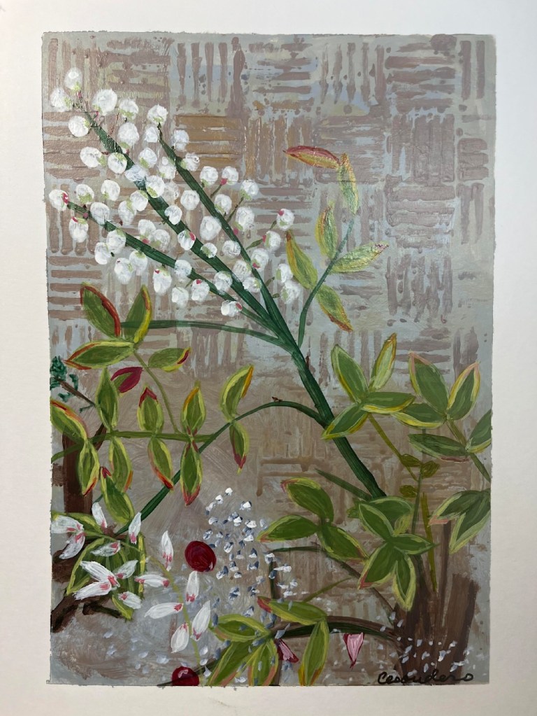
Next I used acrylic paints with the same reference photo. I switched to a Fabriano Hot Press 140 lb Watercolor paper for the substrate. I don’t usually use Hot Press, but the finish is similar to the grey paper I used for the pastel, and I was trying to compare apples to apples. I used my three favorite colors of Golden Fluid Acrylics: India Yellow Hue, Alizarin Crimson Hue and Manganese Blue Hue. I also added some Payne”s Grey (for background) and Titanium white (for opacity). Instead of trying to reproduce the texture in the wall, I used one of my favorite templates here and there to give some texture.
The main challenges were:
- Capturing the texture of the wall
- Forming thin enough lines for branches and leaf outlines (I struggle with thin lines in acrylics… I am a work in progress 🙂
- Getting a grey wall with texture (I cheated with a template)
The main points of interest I captured using the acrylics were:
- Getting a nice white on the beautiful buds in upper left
- I achieved more depth in the two small trunks in the lower right and mid-left areas
- The green finally turned out very close in intensity to the reference photo
- The red really popped
I am very comfortable with acrylics. I have been working with them for almost ten years. I like how this painting turned out. My main issue with it is that the Hot Press paper ripped when I pulled off the tape, so that I do not have a clean margin around the painting. (I need to make sure I always use the right kind of paper tape to avoid this!)
Here is the finished piece:
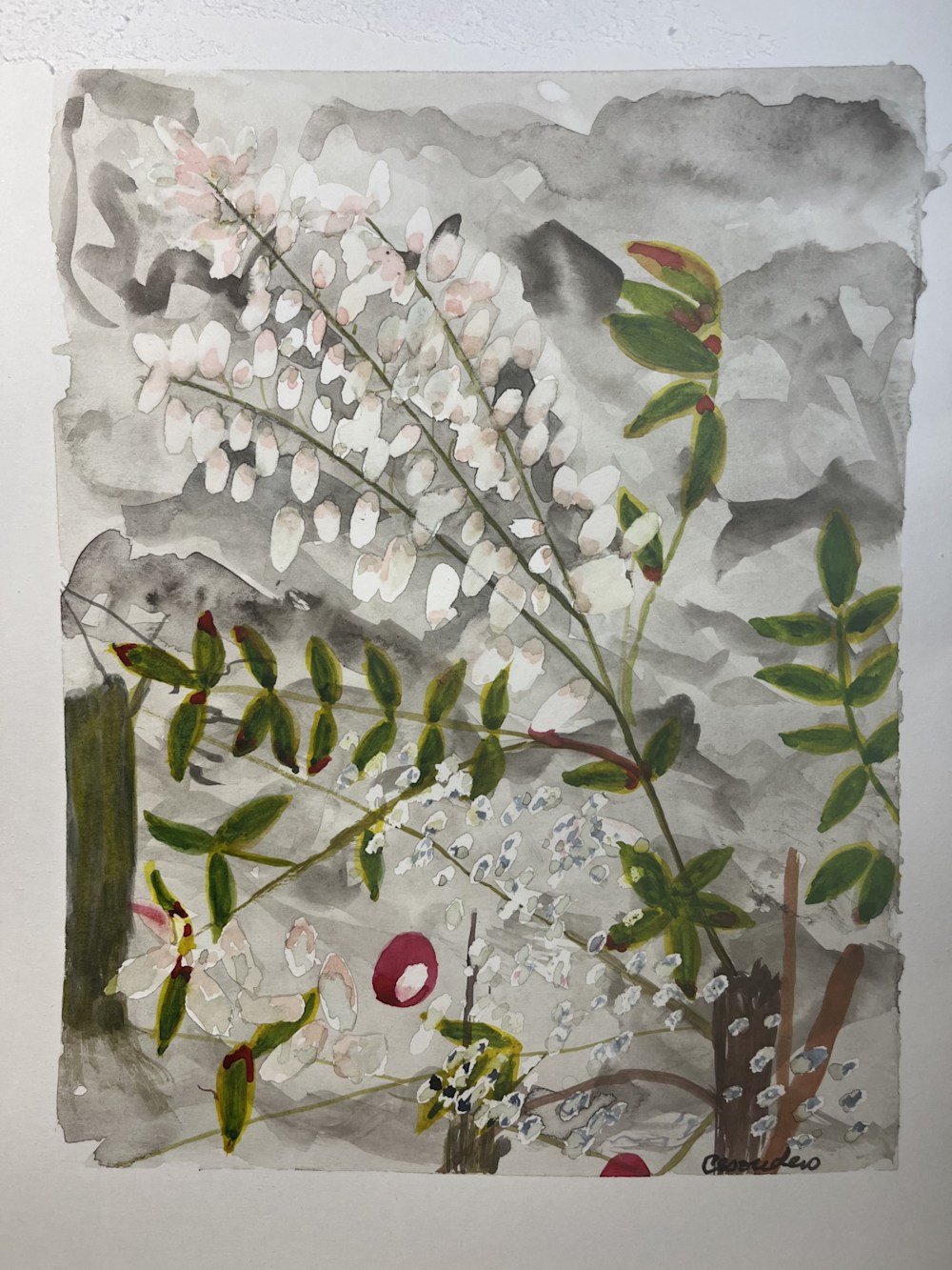
On to Watercolor:
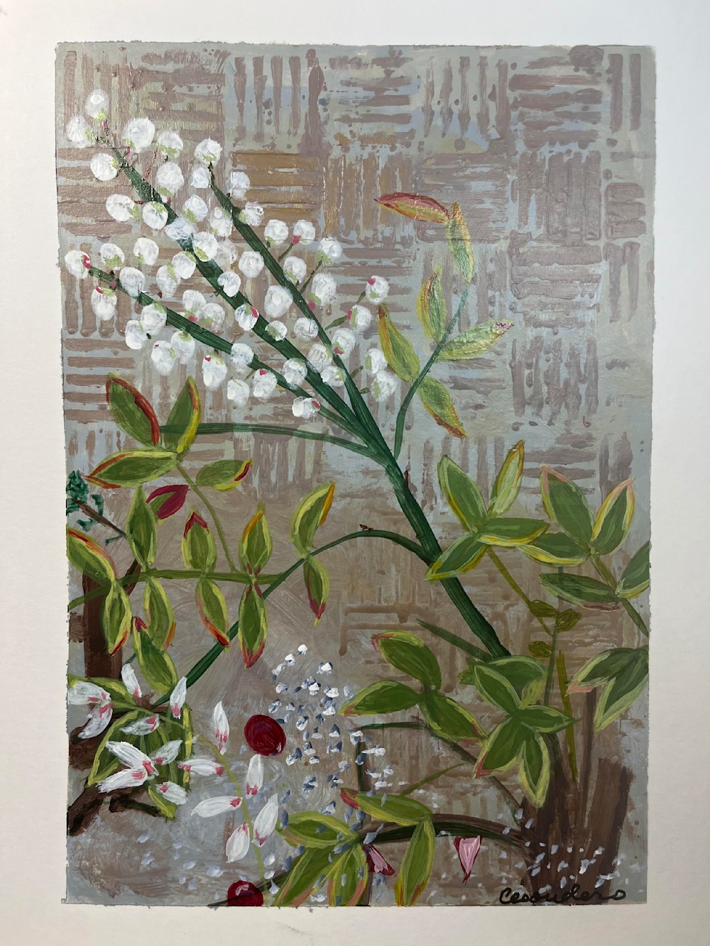
As I’ve said, I don’t usually use the Hot Press watercolor paper very often. But I wanted to keep as many attributes the same for comparison purposes. I found it easy to buckle under the water, which cold press does not do for me. I used two Art Philosophy tins for my colors — Decadent Pies and Woodlands.
The main challenges were:
- Capturing the texture of the wall… I tried to mix shades of grey to give the appearance of texture, but it looked more like clouds.
- My branches stand out too mucy
- I wasn’t able to capture the lovely yellow/white borders around the leaves. They need that.
- Using the masking fluid to capture true white for the buds, my spots were too large and they lost their pretty shape.
The main points of interest I captured using the watercolors were:
- Getting a nice contrast with the white on the buds in upper left
- I achieved more depth in the two small trunks in the lower right and mid-left areas
- The green finally turned out very close in intensity to the reference photo
- The red really popped
Here is the final result of the watercolor version:

To be fair to all three mediums I tried to keep as much similar as possible:
- I took the pictures under the same light at the same time of day.
- I used the same texture of paper for all three, though the pastel was on a grey color.
- I tried to reproduce the same colors, but when I found I could not get the white buds to pop on the pastel grey background, I added a touch of blue.
- I did not use the enhancement tools on any of these that I usually use in my work (charcoal, black pen, white pen, oil pastels for highlights). Each method is purely one medium.
- They are all the same size — about 8×10
Here is a picture of all four (including reference photo), just for giggles:

I hope you enjoyed this look at the differences of three very different mediums. If you liked this, you may want to read some of my Online Art Class Reviews. I pick a different class each week, take the course and share my experience, plus my handiwork from the class.
Thank you for reading!